It fixes ALL the weird coding problems created when you combine files in LibreOffice if you use Insert: Text from File instead of copy/pasting text.
Ditto with combing PDFs—highlight files, right click, and choose Quick Actions: Make PDF.
production
It fixes ALL the weird coding problems created when you combine files in LibreOffice if you use Insert: Text from File instead of copy/pasting text.
Ditto with combing PDFs—highlight files, right click, and choose Quick Actions: Make PDF.
So, the proof of the hardcover edition of A Dislocated World showed up. The proof took longer to get here than a normal paperback proof, and I don’t know if that’s because this is in beta or if that should always be expected.
Honestly, I think it looks pretty good, although I have no idea how durable the binding is going to be or anything.

The stupid banner is annoying, of course. But the cover template gave a pretty accurate idea of what would be visible and what would not be.
The cover is (quite) matte, and the art is printed directly on the cover—just like you see with a lot of YA nonfiction titles. There’s no jacket, but hopefully it’s a little more durable for the librarians out there.
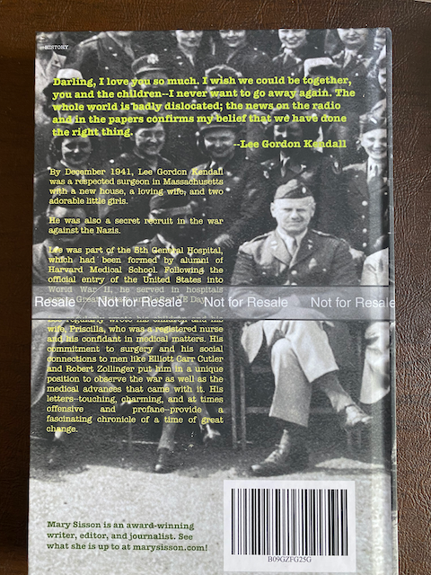
Good luck proofing that cover text, though!
With this particular book, I did not have to adjust the interior layout. The binding’s a bit tight, though, so the gutter is a little tight as well.

I feel like this is good enough, but certainly if you need to adjust the layout from paper to hardcover, I would throw any extra margin space right into that gutter. If people have to force the book flat to read the text near the gutter, then that will significantly reduce the lifespan of the book, which will make the librarians all sad again.
I approved it for publication as well as the large-print edition of Tribulations, so they should both show up on Amazon soon. The hardcover can’t be put on expanded distribution (at least not yet), so keep that in mind if you’re thinking of doing one.
Did five more chapters of the Tribulations large-print layout—it went quicker this time with less drama, because I realized that part of the problem is that Scribus doesn’t automatically put soft returns after em-dashes. That’s always been A Thing with Scribus layouts, but it is especially a thing when the text is 18 points! I just kept an eye out for that issue when I was laying the text out, and I wound up only having to fix one after the layout was done (which didn’t screw anything up).
I’m totally not the most-advanced Scribus user out there (or any layout software, to be honest), but I’m wondering if there’s some way to set the preferences so that an em-dash and a hyphen are treated the same way—it would probably save me some time to figure that one out.
Got some decent sleep, and lo and behold, the things that were causing me such problems were fixed super-easily today! Sleep: An actual miracle cure!
I ordered a new proof of the trade paperback. I’m kind of thinking there will be another because it’s kind of hard to know if you put the chapter ornaments in the right place without an actual book to look at.
ETA: I decided to resume work on the large-print edition—whew! I finished laying out the first five chapters, and then basically on a whim I proofed them. And then I realized that, oh, yes, one must proof a layout every few chapters, especially with the large-print edition, because I very nearly lost a page—I managed to avoid having to lay out a couple of chapters again from scratch, but it was very close thing.
I got the proof of the Tribulations trade paperback yesterday, and there’s the gazillion little things I want to noodle with on the cover, plus (and I feel very silly about this) I forgot to put chapter ornaments in the layout. It’s a funny thing, right? But the earlier books had little black-and-white portals to indicate breaks within the chapter, and without them—well, for starters, it’s just a bit sad, but also there were a number of places where I actually thought a new chapter was going to start on the next page, and then it didn’t, and that confused me. So I am sprinkling in the little portals anon.
Except that I didn’t really get enough sleep last night, and while I feel like I can and have done certain fixes, others are too hard when I’m tired. So I’m calling it quits for today.
I prepped all the chapters in LibreOffice today so that they’ll be ready to lay out.
Just to give you an idea of what that entails:
Copy the original LibreOffice file
Make text flush left/ragged right
Make text 18-pt san serif (I’m using Tahoma this time around, because I like it)
In paragraph formatting, set all the indents & whatnot to 0”
Except for space between paragraphs, which is 0.3”
Set spacing to proportional 125%
That gets me near-enough to APH for my satisfaction, while still having the text blocks line up once it goes into layout.
The copy editor got Tribulations back to me! That’s nice—assuming it doesn’t need too much work, I should be able to have the e-book and regular paperback out sooner rather than later.
Ugh, I feel like I should figure out some kind of marketing plan, especially since people have waiting so long for book three, but…bleagh. I mean, the issue is that my life is quite a bit busier now, and I never really enjoyed marketing, so…. For sure, if you don’t market you don’t sell books, but I don’t really need to sell books to make a living, so it’s hard to motivate. If it were a stand-alone book I just wouldn’t care, but I do feel badly because the series did have fans who have waited forever…le sigh.
Amazon wanted me to fiddle with the paperback pricing, because they’re selling paperbacks in Australia now. Fine by me—all the paperbacks except Dislocated World were done on CreateSpace, and there’s some weirdness with the distribution in Amazon’s markets as a result, so I figured I’d fix that.
Then I got to feeling like I should order proofs of the paperback versions of Trang, Trust, and The Weirld, because who knows? Strange things can happen when you switch printers.
I did that, they came…and yeah, they look a little funny now. Like, the covers are there and the interiors are there, so you’re getting a book, but they definitely rendered a little differently, and I feel like they could all use a bit of an update just so that the type is clear and whatnot. You know, once I have the chance to do that. In the meantime I went ahead and approved them, since they’re readable and whatnot.
Aaaand Amazon just told me that Trust cannot be approved for publication because the cover has errors on it.
Remember: I ordered a proof. If there are the kind of errors that make a cover so that it can’t be published, that’s supposed to come up before the writer pays for the proof. Traditionally, the proof is supposed to be the finished product, and proof approval = ready to go.
I guess when you’re deliberately making the proof cover so that no one can see the art, this all makes perfect sense.
I finished Part 1 and set up Part 2—definitely the best way to proofread an index is to use it as the basis for a second. This week is going to be kind of busy, so it may take some time to get everything finished up, but again, I’m definitely finding small mistakes in the trade paperback index (plus I caught a layout error!), so I think it’s worthwhile.
I went to work on Part 2, and of course I forgot that, given the length of the chapter, I should stop every 10-20 pages and make sure nothing’s been missed. I was 100+ pages in (it’s a looong chapter) before I went back and realized there was an error on about page 30 that will probably affect the rest of the chapter. Tomorrow!
Well, I’m still working on Part 1 of the large-print layout. I decided that not having the bottoms aligned was driving me crazy, especially because it was happening when there was no real reason for it to happen—i.e. in situations other than, That’s the way this particular letter fell. The issue (and I have a vague recollection of this being a problem in my earlier books as well) is that the APH guidelines set you up so that if you don’t have the exact same number of hard returns on each side of the page, the text blocks won’t line up. So I fixed that by putting less space between paragraphs—which, if memory serves, is why all my books are mostly APH compliant rather than entirely APH compliant.
Because you don’t indent the first line of paragraphs in APH, you automatically put line space between paragraphs. So the places where I had inserted line spaces between paragraphs in the trade paperback now look like this:
Which is completely ridiculous. So I fixed that…I think to my satisfaction, although I’ll give it another look tomorrow. I’m leaving a lot of line spacing in some situations, just because I think it gets confusing not to. This is just a tricky book to lay out, because you have the letters and you have my commentary, and it’s important that readers are able to tell the letters apart both from each other and from the commentary.
The allergies are interfering with sleep, so I decided to prep Dislocated World for when it leaves Amazon and goes to other e-retailers. A lot of removing tabs and that sort of routine stuff—the main concern is that when the file is converted, it will fuck up all the italics and underlines and strike-thrus, but there’s not a lot I can do about that at this point. Just got it as clean as I could, and fingers crossed that the conversion goes well.
I proofed the index and then did a spot check—not surprisingly, when there were typos, the page number tended to not be accurate. But the post-proofread spot check revealed all of one error, and in all honesty I don’t know whether that should please or worry me. I didn’t see any errors in the Part 3 page numbers that came up.
I’ll do the cover tomorrow, probably—it’s spring, and if I don’t pay some attention to the garden, I’m going to be overrun.
After waxing the cats, I proofed and indexed the rest of Part 2.
Indexing this book is a little weird, because the standard advice is that you don’t index a name mentioned in passing. So, yeah, my grandad says something about Marlene Dietrich, and I don’t index it, because it’s not like he knew her or has anything important to offer.
But when he writes something like, “Yesterday Fred Smith told me that Joe Blow is in Africa,” and that letter has a date on it….then I feel like I should index Joe Blow, because his family might be very interested to know where he was and when. So I’m indexing a lot of trivial mentions of non-famous people, but then again, I kind of feel like giving people access to information about relatives who haven’t had history books written about them is why I’m bothering to do this damned index in the first place.
So, it turns out that indexing is one of those activities that’s actually pretty easy to do…until you absolutely hit a wall and just can’t do it any more. A little like long-distance driving, for me at least. It definitely helps to know the material—it also helps that I was careful not to actually read the book again when I did the layout until now. Definitely when doing an index you don’t want to be so used to/tired of the material that you just say, “Oh, yeah, Jim again—he shows up a lot, no big deal.”
I’m indexing and doing a final read at the same time, which so far I think is working OK? I have found a couple of errors, some of which I’ll need to fix in the e-book, so I feel like I’m not completely worthless as a proofreader just yet.
I did the Introduction and Part 1 before I hit the wall, and if the schedule allows I’ll probably be able to do Part 2 in one day and Part 3&4 in one. Then it’s a matter of getting the cover ready, and I’ll have a print book!
I finished & checked the layouts for Parts 3 & 4 (which together are about equal in length to Part 1 or Part 2), plus I laid out the front matter and the Resources page in the back. The other bit of back matter is going to be the Index, which…pray for me. I’m going to try giving the layout a final read while indexing it—we’ll see how that goes. This is my first index!
Part 2 (which is even longer than Part 1!) is done—that seems to have gone a lot quicker. I’m going to be optimistic and say that’s because I sorted out how I wanted to handle laying out letters back during Part 1, but it could also be just that I didn’t get enough sleep last night and am missing all the errors. The final read will tell, I suppose….
Anyway, I’ve got Part 3 into the layout software, so yay.
I was a bit busy today, but I figured I’d at least get Part 2 set up so that I could get a lot done on it tomorrow. When I started the new file, I realized that I had set the pages up in the earlier sections to be 8 x 5.5 inches instead of 8 x 5.25 inches. Whoops! Given the length of what I’ve laid out already and the fact that this book isn’t part of a series, I decided to just make the pages 8.5 x 5.5 inches with a slightly larger top & bottom margin than before. Making do!
Part 1 has been laid out, and the layout has been gone over. Yay! That’s a big job—Part 2 is just as big and starts on the left-hand side instead of the right, so…hard work is good for the soul, I guess? Probably won’t get to it until the weekend.
As I mentioned, Part 1 is 49 pages long, which is reeeeeaaallly long for a chapter layout. It occurred to me earlier that I should probably print out only 5-10 pages, because a change early on could alter the next 48 pages. So naturally I printed out the whole thing at first…oops. We’ll see if I learn my lesson when I’m doing Part 2.
So, I had foolishly initially laid out Part 1 before laying out the Introduction—it turned out not to matter, but if you ever decide to lay out a paper book, I strongly recommend you start at the book’s actual beginning, it will potentially save you a lot of time. Anyway, after I did the initial layout of the Introduction and printed it out, I decided that the font was too big, so I took the font down two points.
Those two points reduced Part 1 from 79 pages to 49! So, yeah, as much as I hate the teeny-tiny print, you do want to make the font as small as you can while keeping it readable. (Also a big font makes a book look like a kid’s book.)
I’m looking at this book and realizing that, since it’s nonfiction, the paper version should really have an index. That’s not going to be too much fun to do. But I think I should, because you can’t search it the way you can an e-book.
The font is, of course, Georgia.